
I couldn't do much for #inktober this year. I'm still cleaning up some pieces I've made so I'll share that very soon! I'm venturing into responsive design, Wordpress, WooCommerce and PHP all at once. Like a crazy person. It's eating up most of my time.
Of course the thought of a rebrand came up while I was setting up Wordpress. Tiny Moon will most likely go live first. I'm hoping to add new products, better pictures and soon... art prints! Part of the rebrand made me evaluate everything and I felt like the visual part no longer fit. I didn't want to do minimal anymore. I went out of my comfort zone to use colors and keep it cute with graphics.
Our shop is basically filled up with cute items so why not match it?
Instantly knew I wanted something more cartoon. A soft, round bubble font with at least a small moon and some animal. I was thinking ahead as well: cute animal logo on future packaging.
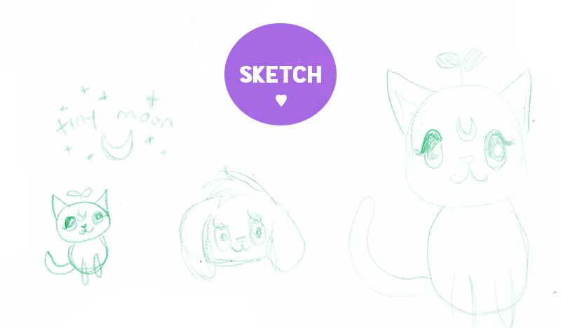
One suggestion for the animal was a fox but this is rather funny: both of us already have foxes in our other shops. You can take a look here & here. That would be too much! I did some quick sketches then scanned it.
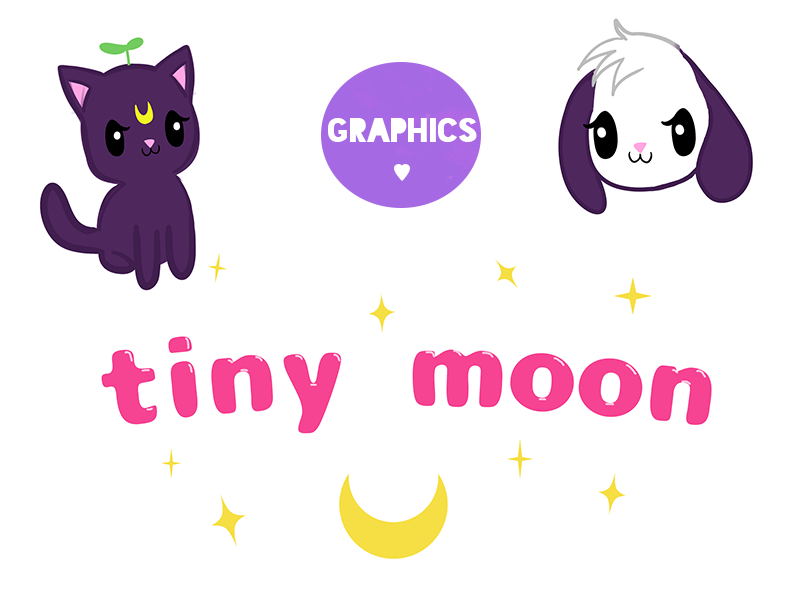
Since I'm more of a visual person, I knew I had to draw some up to use as placeholders. (Added a leaf on the cat's head for funsies.) That bottom logo was my original idea from the sketch but it didn't pop for me. I also refused to cop out and stick with the usual white space.

These are the final results. I made various sizes for the shop and social media. Plus using a cute cat as a profile image/avatar is fun.
It took awhile to finally settle on colors. I limited it down to this pastel palette. A thick white stroke was added to make the font and moon stand out. It's definitely still on the simple side but is unlike our previous branding which was mostly white space.
What do you think?


Post a Comment